The Houston Rockets are officially launching into a new aesthetic era. On Thursday, the franchise revealed a comprehensive brand refresh, showcasing Houston Rockets new uniforms and an updated logo system that masterfully blends the team’s championship history with the city’s identity as a global leader in aerospace. The new look marks a significant departure from the minimalist designs of recent years, leaning heavily into the nostalgia of the 1990s while looking forward to a future defined by innovation.
A Nostalgic Return to the 'Ketchup and Mustard' Era
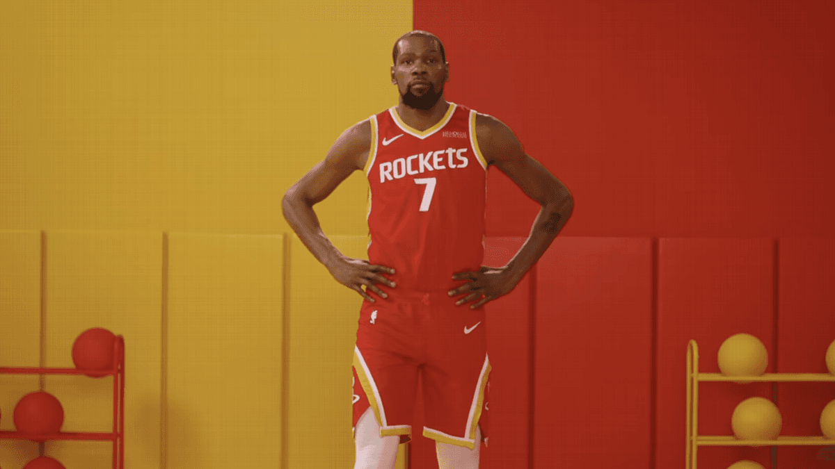
For a generation of basketball fans in Houston, the colors red and yellow represent the pinnacle of the franchise's success. Known affectionately as the "ketchup and mustard" era, this color palette was worn by legends like Hakeem Olajuwon and Clyde Drexler during the team's back-to-back NBA championship runs in 1994 and 1995. The Houston Rockets new uniforms bring these iconic colors back to the forefront, satisfying a long-standing demand from the local fanbase.
The decision to reintegrate these classic colors isn't just about fashion; it is about reclaiming the team's most successful visual identity. The vibrant red serves as the base for the primary sets, while the bold yellow accents provide a high-contrast look that stands out on the hardwood. By returning to this scheme, the Rockets are bridging the gap between their legendary past and a young, promising roster that looks to build a new legacy in the Western Conference.
Updating the Visual Identity: Primary and Secondary Logos
While the uniforms are the centerpiece of the reveal, the Rockets also introduced key updates to their branding. It is important to note that the team’s iconic stylized 'R' remains the primary logo. However, it has been updated with yellow accents to align with the new color palette. This ensures continuity for the brand while refreshing the look for a modern audience.
The most striking addition to the brand family is the elevation of the 'Dunkstronaut' as an official secondary logo. This character, which has appeared in various marketing materials and secondary branding in the past, depicts a stylized astronaut in mid-flight performing a powerful dunk. The Dunkstronaut serves as a direct tribute to the Johnson Space Center and the city's pivotal role in the American space program, moving the brand toward a symbol that resonates with the local community's history of exploration and achievement.
Detailed Look at the Houston Rockets New Uniforms
The design of the new uniform collection includes several subtle details that pay homage to aerospace engineering. According to the team, the typography used for player names and numbers has been updated to a more modern, geometric font that reflects a futuristic aesthetic. The collection is divided into three core editions:
The Association Edition
The Association Edition serves as the team's primary white uniform. It features a clean white base with bold red lettering and yellow trim. This design provides a crisp, classic look for home games while incorporating the updated color scheme in a balanced manner.
The Icon Edition
The Icon Edition is the team's primary red jersey. It features yellow lettering and side stripes that mimic the trajectory of a rocket launch. This set is the most direct callback to the championship era, utilizing the high-energy red and yellow combination that defined the franchise in the mid-90s.
The Statement Edition
The Statement Edition is a darker, more aggressive design that leans heavily into the "Space City" theme. This uniform features a black base color and is detailed with unique 'quasar-inspired' pinstripes. The pinstripes are designed to evoke the appearance of light trails in deep space, providing a textured, metallic-inspired finish that sets it apart from the standard home and away sets.
Embracing the Space City Legacy
The Houston Rockets have long been intertwined with the identity of their home city. From the team name itself to the names of their former arenas, the connection to NASA and the aerospace industry is foundational. By doubling down on this theme with the new uniforms and the inclusion of the Dunkstronaut secondary logo, the organization is reinforcing its role as a cultural pillar in Houston.
This rebrand comes at a pivotal time for the franchise. With a core of young talent and a renewed energy within the organization, the new visual identity serves as a fresh start. Fans can expect to see the new gear on the court starting this fall, as the Rockets aim to propel themselves back into playoff contention while wearing colors that remind the world of their championship pedigree.
Sources & Original Reporting